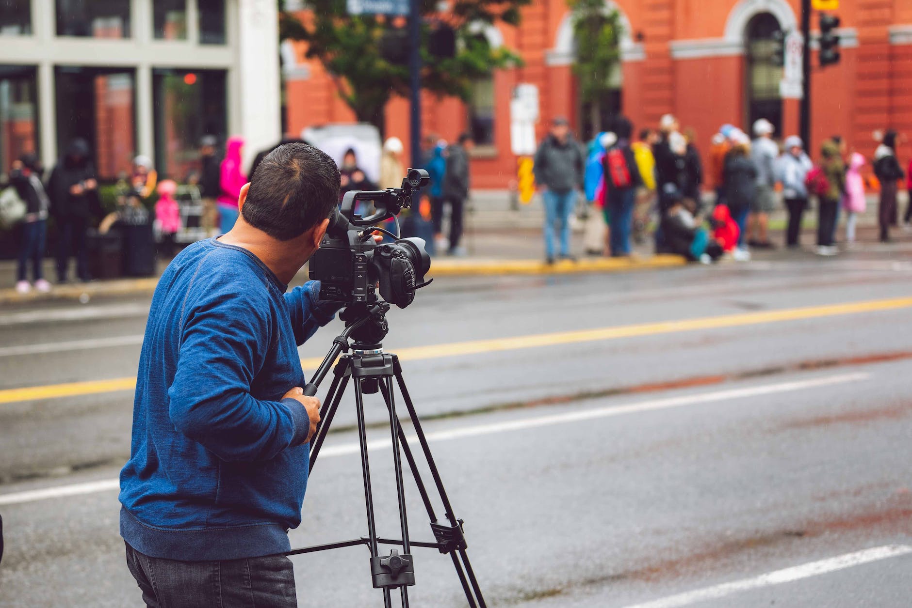
OK, now that I can do the basics, how can you add all the details, it turns out that Final Cut Pro is really like iMovie’s big brother, so in the upper left, the object browser that has the ability to import what’s in your existing machine including Photos, Music and they have a huge list of sound effects too. But the final tab is a set of templates for titles and also for generators that are built in such as adding drifting bubbles.
Import from Apple Photos, but we need more
This isn’t that obvious, you would think it is in the File/Import command but that is just for Files, instead, go to the object browser are the upper right or Shift-Command-1. Note that at least for my 60K Photos library, this is unbearably slow, takes about a minute to select photos. I think because there is caching from the Internet going on. But the Beachball is pretty frustrating. And then I get a Missing Remote Media message and even when the clip is up, it is extremely slow. You should drag it Overy slowly until you see the thumbnail and then gently pull it down to the timeline.
The easy way to do that is you go to the Photos application and click on it and let it do the download and then go to Final Cut Pro. This can also happen if you happen to lose the Internet, the download will fail without warning.
Compositing two clips together
This is a fancy thing to do to take titles and things and overlay them on top of existing videos:
- Keying. This is also called the Chroma key which is how green screens work. Basically, you can set a specific color or light value. You get this from the lower right in the Effects menu
- Opacity. Basically, it is pretty easy, so select a clip and then hit Q or drag it above the main timeline at the bottom. By default, the main clip is completely obscured. So go to the Video Inspector that is at the upper right or press Command-4 and click on the new clip that is going to overly. This works in clips by the way, not with Generators, and not all effects have opacity
Ken Burn Effects: aka Pan and zoom clips
Sometimes when I just have a still but want to make it look like a video, the Ken Burns effect is a great way to do this. This by the way is named after a famous documentarian who used it first on things like civil war photos to give that feeling of movement on a video. In order for this to work, you need to make sure the center Window is large enough, then click on the image and the Crop icon at the lower left and you should get some choices: Trim, Crop, or Ken Burns.
Audio Volumes
It is pretty confusing how to do this, but the best way is explained by Matt Perreault, but basically, you click on the sound icon on the upper right and then you can see the audio level. If you click on the triangle on the upper right and then click on the timeline and you create a keyframe. Then the audio levels can be set there and do it precisely. The goal is to get the levels as close to 0 dB as possible.
Fancy Titles: RenderForest was nice but Apple Motion is cool and Mixkit is cool.
But what about doing your own special effects? There are two ways, there are plenty of free FinalCut Pro templates out there or you can use Apple Motion to generate your own special animations.
But, I did find that Mixkit has some nice free titles. But it is a little tricky to get them installed. The video is not quite right. It basically tells you to download the free templates and download them into ~/Movies/Motion Templates/Titles, but I found that not all the downloads worked there. The ones called Full Screen Glitch and Logo Glitch worked, but while I could change the text with Full Screen Glitch, I could change everything, but Logo Glitch, I didn’t see how to change the Mixkit logo.
Tracking with Final Cut Pro
One cool thing that you can do is to attach a title or other object to something that is in motion in the main timeline. For instance, if you have a racing car and want to put a tag underneath for the driver’s name. This works amazingly well, just drag from the object browser at the upper left directly onto the preview window (No really this works) and you can select an object and it will try to track it as it moves. Pretty neat. You can do more in Apple Motion, but for many simple cases, this is enough.
Yo
What’s all this then about Chroma Sampling (and HDMI)
This is a bit of a special topic, but it comes up with Final Cut Pro all the time. That is Chroma subsampling. Not first of all the traditional computer displays (VGA, EGA, DVI) don’t have this, they are output in RGB and there are no tricks to play. But the formats that are based on televisions like HDMI doe have this color compression, they transmit in a format called YCbCr which means luminance Y and the difference for blue and red.
This has always been the hardest for me to understand and I’ve gone over chroma sampling a dozen times. But to remind me, the main idea is that humans see differences in light and dark very well, this is called Luminance Y. So if you are doing say a 4K video, you will want full luminance resolution. Technically this means a full horizontal resolution of 2160 lines and a full vertical resolution of 3860 columns. So the term 4:4:2 comes from the old days of television where the trick was what is called interlacing. That is a 480i display will show 240 lines in one frame and then in the next frame will display 240 of the other lines. So the system is designed around alternating things because the old CRTs couldn’t draw fast enough, so they played a trick and that was good enough for television (which is why in old TVs, you could literally see the scan lines.
Of course in this modern world, we’ve moved from interlacing to progressive scanning, which means you write all the lines at once. Also note that there is confusing technology, at first computer people would talk about how many horizontal lines there are, so you would have 240i, 480i then 720i, and finally 1080i. But, when the television people got involved, (I think probably to make everything sound bigger), the language shifted to the total vertical column. So a 1080p display is really 1980 vertical columns so would be a 2K display. Similarly, a 4K display or 3860×2160 is a 4K display and in the old way would be called 2160p. Confused yet?
Now the other curious thing is that there have been different standards for aspect ratios. The original televisions were 4:3 and then we moved to 16:9 because that was widescreen and better suited to panoramic movies. That is where the 1080p comes from and 4K is basically doubling.
Chroma 4:2:0 all the edges and a quarter of the colors
That’s a long preamble to explain what the Chroma term 4:2:0 means. What it is trying to communicate is what you do in the old interlace days. That is what can you transmit across 4 pixels (that’s the first digit), so in the first line, you will get 2 bits of blue Chroma and red Chroma called Cb and Cr. This is just the difference between Y, so Y+Cr gives you the red tones. Note that the first compression here is that you only get half the number of vertical bits, so in a 4K display with 3860 columns, you get 3860 columns of luminance but only 1,930 of color. So that’s a big compression that the ordinary eye doesn’t notice.
The second trick is that on the second line, you get 0 new information (that’s the third number), so you just repeat the Cr and Cb you had from the first line. That’s even more compression. But another way a 4:2:0 signal halves the vertical resolution and horizontal resolution, so in a 3860×2160 display, you get 1930×1080 worth of color, so quite a savings.
Nearly all the common systems of the 2000s used this scheme including Blu-ray disks, MPEG-2, DVDs, JPEGs, and WebP.
Chroma 4:2:2 all the edges and half the colors
OK, so the more advanced systems like Apple ProRes, Serial Data Interface, etc. have more color in particular with 4:2:2 you do the same halving of the vertical colors (that’s the second 2) across four pixels, but the 2 instead of zero says that on the alternating line, you get 2 more colors. In other words, you get the full horizontal color resolution but only half the vertical. In practice, the difference between 4:2:2 and 4:2:0 is very hard to see because we simply can’t see that quick a color gradation.
So where does 4:4:4 or 4:2:0 matter? Computers and green screens
There are two cases where this makes a difference, the first is in computer output. Unlike most images, there is *alot* of color differences, computers are very precise, so losing the 4:4:4 is a problem when displaying color. Right now I’m using a LG B9 with a MacBook Pro with HDR (that’s another topic because the panel is trying to map 10-bit color into an 8-bit panel) at 4:2:0, so what happens is that you can see little halos around the characters.
The other place it makes a difference is on green screens. If you watch Zoom output for instance, you can see there are green halos, that’s because the color resolution is half on the vertical, so it is hard to set the mask exactly right.


